Pages section
List and edit subpages
A pages section can be used to show children of the current page or of any other single parent page in your site. It also the standard way for adding new pages to the selected parent page if the selected status option allows it.
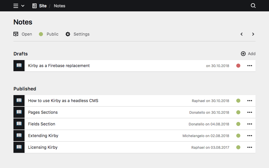
Example
title: Blog

sections:

  drafts:
    label: Drafts
    type: pages
    status: draft
    templates: article

  published:
    label: Published Articles
    type: pages
    status: listed
templates: articleA closer look at pages sections
Show subpages as cards or list, add additional info for each page, control the card design – there are hardly any limits.
A pages section can be filtered by template and by status, but its members cannot be filtered using a query. If you need to query pages, a pages field or a custom section plugin might be an alternative.
Sections do not store anything in the content file, which means that you cannot fetch content from a section in your templates like you would from field content.
Section shortcuts
For simple sections that are only used once per blueprint, you can use shortcuts. In its most basic form, a pages section consists of the section type as name, and true as its value.
sections:

  pages: true
This will add a pages section with all default properties.
These shortcuts can be extended with other section properties as needed, for example:
sections:

  pages:
    label: Main Pages
    status: all
Keep in mind that the same section name can only be used once per blueprint.
Section properties
The pages section has multiple options to control what kind of pages should be displayed, how they should be displayed and what happens if a new page is added.
| Name | Type | Default | Description |
|---|---|---|---|
| create | – | Optional array of templates that should only be allowed to add or false to completely disable page creation |
|
| empty | – | Sets the text for the empty state box | |
| flip | bool |
false |
Enables/disables reverse sorting |
| headline | – | The headline for the section. This can be a simple string or a template with additional info from the parent page. | |
| help | – | Sets the help text | |
| image | – | Image options to control the source and look of page previews | |
| info | – | Optional info text setup. Info text is shown on the right (lists) or below (cards) the page title. | |
| label | – | label is the new official replacement for headline | |
| layout | string |
list |
Section layout. |
| limit | int |
20 |
Sets the number of items per page. If there are more items the pagination navigation will be shown at the bottom of the section. |
| max | int |
– | Sets the maximum number of allowed entries in the section |
| min | int |
– | Sets the minimum number of required entries in the section |
| page | int |
– | Sets the default page for the pagination. This will overwrite default pagination. |
| parent | string |
– | Sets the query to a parent to find items for the list |
| size | string |
auto |
The size option controls the size of cards. By default cards are auto-sized and the cards grid will always fill the full width. With a size you can disable auto-sizing. Available sizes: tiny, small, medium, large, huge
|
| sortBy | string |
– | Overwrites manual sorting and sorts by the given field and sorting direction (i.e. date desc) |
| sortable | bool |
true |
Enables/disables manual sorting |
| status | string |
Filters pages by their status. Available status settings: draft, unlisted, listed, published, all. |
|
| templates | – | Filters the list by templates and sets template options when adding new pages to the section. | |
| text | {{ page.title }} |
Setup for the main text in the list or cards. By default this will display the page title. |
Headline
The headline will be displayed above the pages section. You can pass a simple headline as a string or you can provide translations for multiple languages, if you have an international editing team.
Single language
label: ArticlesMultiple languages
headline:
  en: Articles
  de: Artikel
  es: Artículos
Placeholders
You can inject information from the current page into the headline with template placeholders using our query language.
label: "Articles for {{ page.title }}"Layout
The pages can either be displayed as a simple list or as cards with preview images. The list view is the default view.
List layout (default)
The list layout is perfect for more text-heavy pages, like articles, link lists, simple pages, etc.
layout: list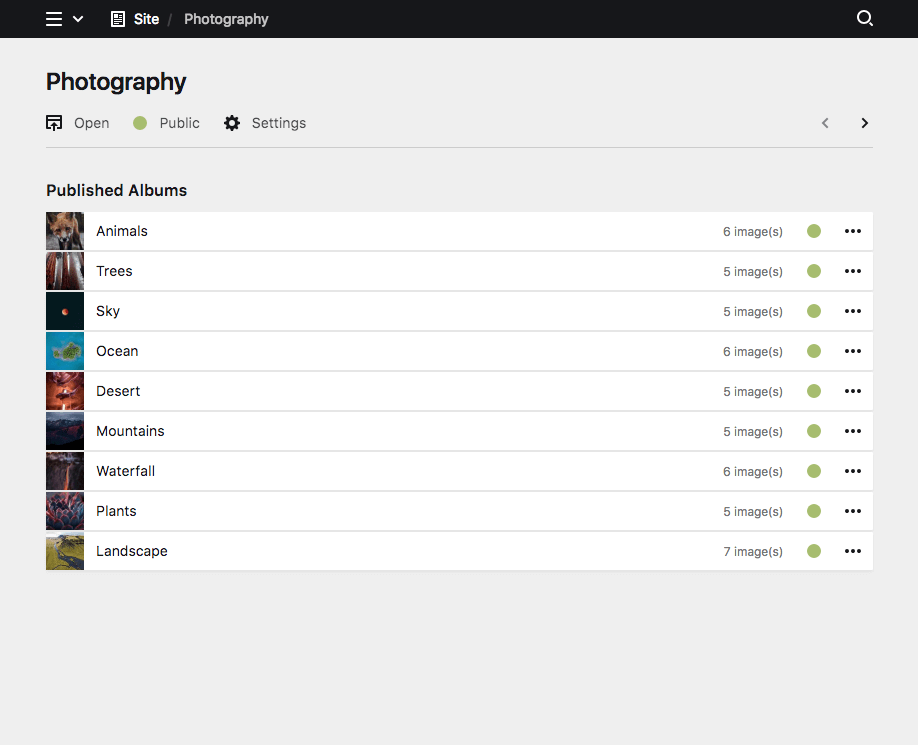
Cards layout
The card layout is great for media-heavy pages, like galleries, products, projects, etc.
layout: cards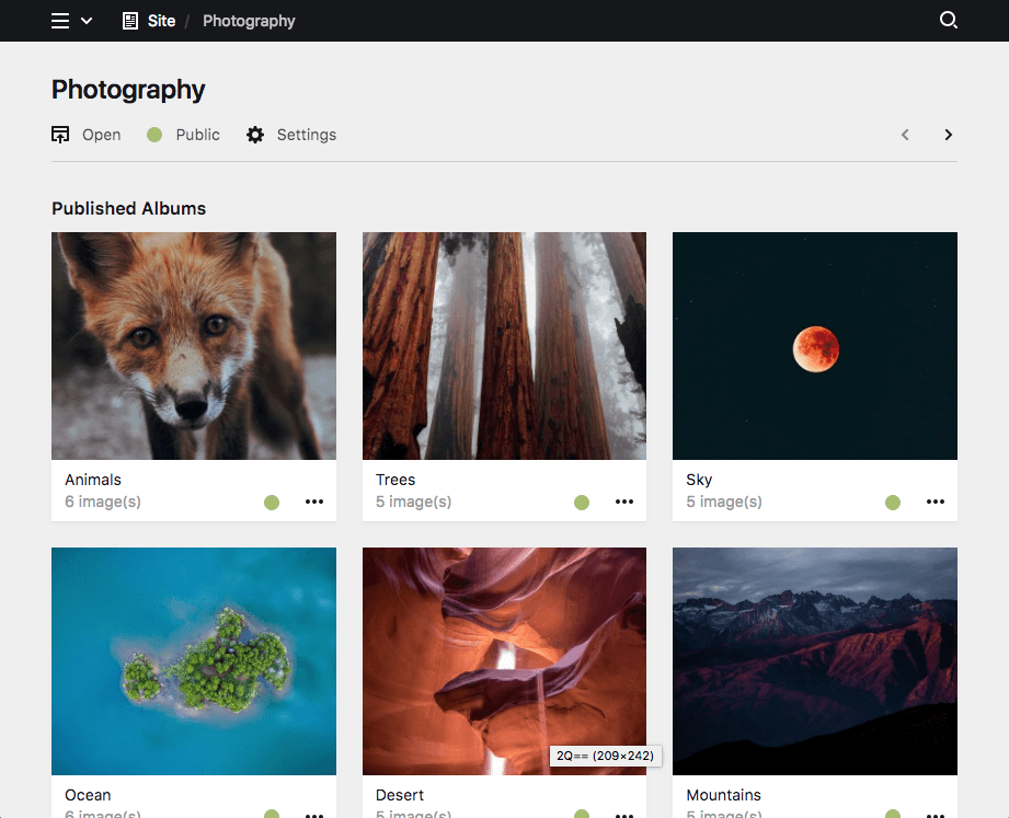
Since 3.6.0
Cardlets layout
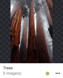
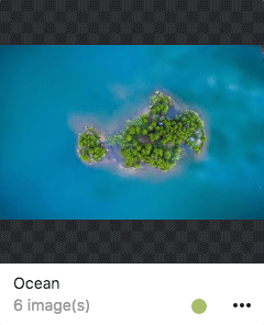
The cardlets layout is great for nice visual previews of files, while your text content is still representend decently.
layout: cardlets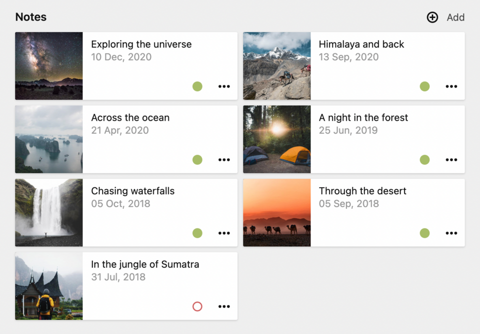
Page information
You can fine-tune the display text and additional information for every page in the list with the text and info options.
text
By default the page title is shown in the list for every page. You can use our template syntax with query language to fetch any information from the page and display that instead of the title.
text: " {{ page.title.upper }}"info
If you want to display additional information for each page, like a date, year, category or any other field value, you can use the template syntax with query language in the info option.
info: " {{ page.date.toDate('Y-m-d') }}"Preview images
The (preview) image for each item in the list is configured with the image option:
image: page.images.findBy("name", "cover")The query has to return an image object, so use toFile when necessary.
When querying a preview image by field name:
image: page.cover.toFileThe default preview image is the first image in the folder.
If you need more fine-grained control you can setup the image for each page with further options.
Preview image from assets folder
You can also provide an image from the assets folder via a page model or custom page method, for example as a fallback if the page has no images:
<?php

class AlbumPage extends Page
{
    public function previewImage()
    {
        if ($image = $page->images()->first()) {
          return $image;
        }
        if (file_exists(kirby()->root('assets') . "/images/default.jpg")) {
            return new Asset("assets/images/default.jpg");
        }
        return false;

    }
}
And then in your blueprint
image: page.previewImageNote that a model only works for pages that share the same blueprint. For pages with different blueprints, use a custom page method instead.
Show icon instead of image
To display the icon set in the page blueprint or a default icon instead of a preview image, you can set the image option to icon:
image: iconTo show no image or icon at all, you can set the imageoption to false:
image: falsequery
An image query, default page.image
image:
  query: page.children.first.image
cover
Whether or not the image will cover the available space.
Options: true, false (default)
image:
  cover: true
Examples
ratio
A freely selectable image ratio
image:
  ratio: 16/9
Examples
You are not limited to the example ratios above. In fact, Kirby calculates the ratio for you as long as you enter it in the format a/b
back
Set an image background.
Options: pattern (default), black, white
image:
  query: page.image.findBy("name", "cover")
  cover: true
  ratio: 1/1
  back: black
Examples
Empty state
With the empty option you can define the message which is displayed when no pages are listed in the section.
empty: No articles yetFiltering pages
Parent
By default, the current page is being used as the parent to find children for the list. With this option, any page on your site can be the parent of the section
parent: site.find("blog")Status
You can filter the list of pages by their status. The available status values are
| Status | Description |
|---|---|
draft |
Only drafts will be shown |
listed |
Only listed pages (with a sorting number) will be shown |
unlisted |
Only unlisted pages (without a sorting number) will be shown |
published |
Listed and unlisted pages will be shown |
all (default) |
Drafts, listed and unlisted pages will be shown |
status: draftNote that an "Add" button for new pages will only be available if you use either status: draft or status: all.
Templates
You can define a list of templates that will be available when adding new pages to the section. It will also be used to filter pages to be contained in the list.
Single template
template: articleMultiple templates
templates:
  - project
  - article
If only one template is available when adding a new page, the template select will be hidden in the dialog (except when the debug option is active).
"Add" button
Editors can add new pages to the section with the "Add" button in the top right corner.
status: all |
status: draft |
status: listed |
status: unlisted |
|---|---|---|---|
| + Add | + Add |
The add button will only show up if the status option is set to draft or all
Why?
New pages are always added as draft. If the "Add" button showed up in sections that only show listed or unlisted pages, the "Add" button would lead to a confusing interaction for editors, as the new page would not show up in the section.
Sorting
sortBy
You can sort the list of pages by one or more fields/properties in descending or ascending order.
sortBy: date desc
sortBy: date desc title asc
sortBy: status desc year desc
The sortBy option will automatically switch off manual sorting.
You can pass PHP sorting type flags, for example to make sorting work with special language specific characters.
sortBy: title SORT_LOCALE_STRING
sortBy: title asc SORT_LOCALE_STRING
flip
Use the flip option to enable/disable reverse sorting (default is false):
sortBy: title
flip: true
sortable
You can switch off manual sorting entirely with the sortable option.
sortable: falseLimits
limit
The limit property sets how many pages will be shown per page. If there are more entries in the section, the pagination navigation will be shown at the bottom of the section.
limit: 20max
You can define a maximum number of pages, that will be allowed in this section. After the maximum is reached, the add button will be hidden and no more pages can be added.
max: 10min
You can also define the minimum number of pages, that need to be added in order to make the page valid.
min: 2Conditional sections
Like conditional fields, sections can be shown/hidden based on the value of a given field (i.e. if a toggle is checked, a select field is at a certain option, etc.).
The condition for displaying the section is set with the when option. In the when option you define a field name as the key and the required value of that field. In the following example, the each section type is shown based on a different value of the postType field:
sections:
  content:
    type: fields
    fields:
      postType:
        type: select
        options:
          - Gallery
          - Image
          - Text
  gallery:
    type: files
    template: gallery-image
    layout: cards
    size: tiny
    when:
      postType: Gallery
  image:
    type: files
    template: single-image
    max: 1
    layout: cards
    when:
      postType: Image
  text:
    type: fields
    fields:
      text:
        type: textarea
      tags:
        type: tags
    when:
      postType: Text
