Date
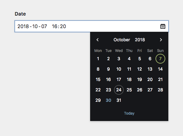
A date picker field
The date field generates a simple input with a nice date picker. It can be setup to display and store dates.
Example
fields:
  published:
    label: Published on
    type: date
Field properties
| Name | Type | Default | Description |
|---|---|---|---|
| after | – | Optional text that will be shown after the input | |
| autofocus | bool |
– | Sets the focus on this field when the form loads. Only the first field with this label gets |
| before | – | Optional text that will be shown before the input | |
| calendar | bool |
true |
Activate/deactivate the dropdown calendar |
| default | string |
– | Default date when a new page/file/user gets created |
| disabled | bool |
– | If true, the field is no longer editable and will not be saved |
| display | YYYY-MM-DD |
Custom format (dayjs tokens: DD, MM, YYYY) that is used to display the field in the Panel |
|
| format | string |
– | Defines a custom format that is used when the field is saved |
| help | – | Optional help text below the field | |
| icon | string |
calendar |
Changes the calendar icon to something custom |
| label | – | The field label can be set as string or associative array with translations | |
| max | string |
– | Latest date, which can be selected/saved (Y-m-d) |
| min | string |
– | Earliest date, which can be selected/saved (Y-m-d) |
| required | bool |
– | If true, the field has to be filled in correctly to be saved. |
| step | – | Round to the nearest: sub-options for unit (day) and size (1) |
|
| time | false |
Pass true or an array of time field options to show the time selector. |
|
| translate | bool |
true |
If false, the field will be disabled in non-default languages and cannot be translated. This is only relevant in multi-language setups. |
| when | – | Conditions when the field will be shown (since 3.1.0) | |
| width | string |
1/1 |
The width of the field in the field grid. Available widths: 1/1, 1/2, 1/3, 1/4, 2/3, 3/4
|
Display format
You can define the format of the date via the display option:
display: YYYY-MM-DD
display: DD.MM.YYYY
display: MM/DD/YYYY| Token | Output | Description |
|---|---|---|
YY |
18 | Two-digit year |
YYYY |
2018 | Four-digit year |
M |
1-12 | Month |
MM |
01-12 | Month, 2-digits |
MMM |
Jan-Dec | Abbreviated month name |
MMMM |
January-December | Full month name |
D |
1-31 | Day of the month |
DD |
01-31 | Day of the month, 2-digits |
The field will parse any input by matching it to the display format. display: DD.MM.YYYY will match an input of 01.05.2015. It will also match partials or slight variations, e.g. 01.05., 1.5.2015, 01.05.15. The base for partials will be the current year, month...
Step
The step option allows you to define intervals of valid values. Any input to the field gets rounded to the nearest interval step.
step:
  unit: day
  size: 2

# only unit, size will default to `1`
step: month

# only size, unit will default to `day`
step: 2
While this is more useful in the time field (e.g. rounding to 5 minute steps), in the context of the date field this can be used, e.g. to let users only select month and year:
myMonth:
  type: date
  display: MMM YYYY
  step: month
Keep in mind that the full date is still stored in the content file, e.g. 2020-05-01. You need to adapt your templates as well to only show month and year, e.g. $page->myMonth()->toDate('F Y').
Time settings
To enable time imput, set the time option to true:
fields:
  published:
    label: Published on
    type: date
    time: true
You can also pass all time field options to the time input:
fields:
  published:
    label: Published on
    type: date
    time:
      step: 1 # 1 minute steps
If you want to define a display option, define it for date and time input separately:
fields:
  published:
    label: Published on
    type: date
    display: MM/DD/YYYY
    time:
      display: h.mm a
Default value
The default value can either be set to a specific date (e.g. 2020-05-01) or as today.
fields:
  published:
    label: Published on
    type: date
    default: today
With the time option enabled, you can set a specific date and time (e.g. 2022-07-01 12:05) or use now for the current date and time:
fields:
  published:
    label: Published on
    type: date
    time: true
    default: now
You can even do date/or date-time calculations:
fields:
  published:
    label: Published on
    type: date
    time: true
    default: now + 1 day
This also works for today. Other relative settings like tomorrow or yesterday will also work, btw.
How to use in templates/snippets
The field stores its value in a standardized format in the content file: Y-m-d for only dates, Y-m-d H:i:s for date and time combined. To convert the value to a date object, use the toDate() method.
Without a date format, the toDate() field method renders a UNIX timestamp:
<?= $page->published()->toDate() ?>Use a date format to render the date in your desired output format:
<?= $page->published()->toDate('Y-m-d') ?>If you have set the date handler to strftime in your config, use the corresponding format syntax:
<?= $page->published()->toDate('%Y-%m-%d') ?>