Creating a custom block type from scratch
Kirby's blocks field comes with quite a few default block types that are great for most purposes and can be customized to your needs. But you probably wouldn't be reading this if you wouldn't be striving for more, and this recipe will hopefully be a great first step into your bright future as a custom block type developer 😉.
Prerequisites
- A Kirby Plainkit or Starterkit for testing
- A code editor
- Basic understanding how to create plugins in Kirby
- For the single file approach, Node 14+ and kirbyup. But don't worry, we also show you how to build this block without such a build process (see link below).
- Probably a big pot of hot coffee and a cool head. We are going to dive deep.
Resources
Useful links
- Registering extensions
- Block previews
- To bundle or not to bundle: differences of creating plugins with or without a build process
What we will be building
We are going to use the example of an audio block type to show you how to create custom block types for the blocks field from scratch, complete with an inline editable preview for the Panel using a single file component with a build process.
A block type plugin basically consists of the following files:
- An
index.phpto register the plugin (required for all plugins) - A block yaml file that defines the fields available for the block type (required)
- A block snippet that renders the block on the frontend (required)
- An
index.jsfile to render a Panel preview (optional) - A
.vuesingle component file (optional, requires build process) - A package.json file for the bundler (optional)
After finishing this tutorial, you should have a solid understanding about block types that will enable you to start building your own, even if you will never ever need an audio block at all.
Final plugin folder structure
When we will be finished, the resulting folder structure of our plugin will look like this. When you are unsure where to put what, you can come back to this overview.
plugins
audio-block
blueprints
blocks
- audio.yml
files
- audio.yml
- poster.yml
snippets
blocks
- audio.php
src
components
- Audio.vue
- index.js
- index.php
- index.js (auto-generated file)
- package.json
Register a new plugin
Let's start with the most important plugin file, the index.php, where we register the blueprints for the block, two file blueprints to restrict file uploads, and the snippet to render the audio block on the frontend.
<?php

Kirby::plugin('cookbook/audio-block', [
  'blueprints' => [
    'blocks/audio' => __DIR__ . '/blueprints/blocks/audio.yml',
    'files/audio'  => __DIR__ . '/blueprints/files/audio.yml',
    'files/poster' => __DIR__ . '/blueprints/files/poster.yml',
  ],
  'snippets' => [
    'blocks/audio' => __DIR__ . '/snippets/blocks/audio.php',
  ],
]);
The block blueprint
In the audio block blueprint, we define the fields for the block that will later show up in the drawer in the Panel. In addition to the files field we need for the audio file itself, we add some additional settings for the audio tag like the controls and the autoplay attributes. And to make it less boring and more enlightening, our block gets a poster image, headlines and a description.
You can adapt this blueprint to your needs, particularly if you want to add track files for audio transcriptions to make your audio files more accessible.
name: Audio
icon: file-audio
tabs:
  main:
    label: Main
    fields:
      poster:
        type: files
        query: page.images.template('poster')
        uploads: poster
        multiple: false
        width: 1/2
      source:
        type: files
        query: page.audio.template('audio')
        uploads: audio
        multiple: false
        width: 1/2
      title:
        type: text
        placeholder: Title
      subtitle:
        type: text
        placeholder: Subtitle
      description:
        type: writer
        icon: text
        inline: true
        placeholder: Description
        marks:
          - bold
          - italic
  settings:
    label: Settings
    fields:
      controls:
        type: toggle
        text: Show controls?
        width: 1/2
        default: true
      autoplay:
        type: toggle
        text: autoplay
        width: 1/2
        default: false
In our blueprint, we create two tabs, one for the general stuff and a second one for the audio settings. This is just to show (off) that you can use tabs to separate your different settings.
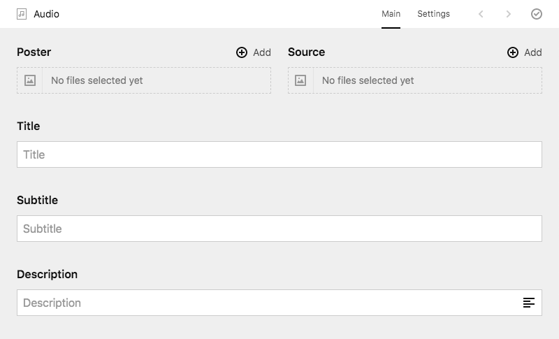
When this block is open, the drawer will look like this:
File blueprints
Since we want to prevent users from uploading non-audio files in the source field, we need a file blueprint, in which we can restrict file uploads via the accept property.
We keep this simple, but of course, you can add fields to allow users to add meta data for the audio files.
title: Audio

accept:
  extension: mp3

fields:
  # some fields here if you want
And while we are at it, let's add the poster.yml blueprint to restrict the file types allowed for the poster field as well. We also want an alt field to fill the alt attribute.
title: Poster

accept:
  extension: jpg, jpeg, png, webp

fields:
  alt:
    type: text
Snippet for the frontend
Inside the block snippet, you have access to the full $block Block object with all kinds of properties and methods, and of course to the fields we defined for the block in the block blueprint.
<?php if ($file = $block->source()->toFile()): ?>
<div class="audio-wrapper">
  <?php if ($poster = $block->poster()->toFile()): ?>
  <figure class="audio-poster">
    <?= $poster->crop(200, 200) ?>
  </figure>
  <?php endif ?>
  <div class="audio-info">
    <h1 class="audio-title"><?= $block->title()->html() ?></h1>
    <h2 class="audio-subtitle"><?= $block->subtitle()->html() ?></h1>
    <div class="audio-description">
      <?= $block->description() ?>
    </div>
    <audio class="audio-element"
      <?= $block->controls()->isTrue() ? 'controls' : '' ?>
      <?= $block->autoplay()->isTrue() ? 'autoplay' : '' ?>
    >
      <source src="<?= $file->url()?>" type="<?= $file->mime() ?>">
      Your browser does not support the <code>audio</code> element.
    </audio>
  </div>
</div>
<?php endif ?>
In the first line, we check if we can convert the filename stored in the source field into a file object, so that the markup of the snippet is only rendered if there is an audio file.
We then check if we have a poster file object, and if that is the case, we render a figure tag with the image.
For the audio element's source tag, we need the file's URL and the mime type, which are available through the file object.
We also check whether to show the controls, and if the audio should start auto-playing on load.
In most cases, controls should be present to allow users to interact with the audio, and autoplay should be off. It's up to you whether you want to make these setting available to the user at all. If not, remove the corresponding fields from the audio block blueprint. Or add other attributes available for the audio element.
We should probably also add some basic styling:
<style>
.audio-wrapper {
  display: flex;
  background: black;
  color: white;
}
.audio-poster {
  width: 12rem;
}
.audio-title {
  font-size: 1.5rem;
}
.audio-subtitle {
  font-size: 1rem;
}
.audio-element {
  margin-top: 2rem;
  height: 2rem;
}
</style>
For the sake of this tutorial, we put the styles within a style tag at the top of the audio.php block snippet. But you can also provide a sample CSS file with your block plugin. Users of your block type can then properly include those styles in their own frontend code.
At this point, our new block is ready to be used in the Panel and can be rendered on the frontend. Time to give yourself a first pat on the shoulder.
Using the new block in the blocks field
To use the new block type, for example in a page blueprint, let's add it to our blocks field.
If you are using the Starterkit, open the file /site/blueprints/pages/note.yml, where we already have a blocks field. It currently looks like this:
fields:
  text:
    type: blocks
To add our custom block, we need to list all fieldsets we want to use for this block:
fields:
  text:
    type: blocks
    fieldsets:
      - heading
      - text
      - gallery
      - audio
      # more block types here if you want
The order we use here will determine the order in which these blocks will appear in the block list.
If you use a Plainkit, add this blocks field definition in the /site/blueprints/pages/default.yml blueprint or create a new blueprint.
For more information how to list fieldsets, create groups of fieldsets etc., check out the blocks field docs.
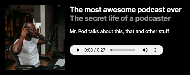
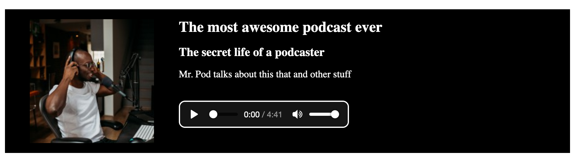
Now head over to the Panel, fill in some data, and open the page on the frontend. It will look similar to this:
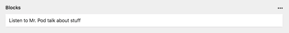
However, our block in the Panel currently looks like this:
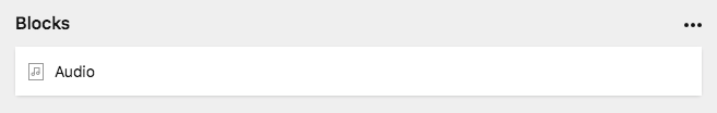
We can surely do better. In the next step, we are going to change this and create a slightly more pleasant preview with an audio tag.
Simple index.js
We can start very basic with an index.js next to the main index.php file:
panel.plugin("cookbook/audio-block", {
  blocks: {
    audio: {
      template: `
        <div>
          Listen to Mr. Pod talk about stuff
        </div>
      `
    }
  }
});
Not really what we want to end up with, but easy, right?
Let's replace this with an audio tag and the title from our block (we leave the other fields for later to prevent being too repetitive):
panel.plugin("cookbook/audio-block", {
  blocks: {
    audio: {
      template: `
        <div>
          <h1>{{ content.title }}</h1>
          <audio controls>
            <source :src="content.source[0].url" type="audio/mpeg">
          </audio>
        </div>
      `
    }
  }
});
We have access to the fields through content, so we can get the title with content.title. The content.source files field returns an array of file objects, so we can fetch the first one with the index 0 and the URL from the url property.
Now listen to this! We have a simple audio tag preview with a title (provided that we selected a file before).
But hold on! If we tried to add an audio block now in the Panel, we will run into an error. Try it out. Why's that? Because we haven't made sure that we actually have a file. Let's change this with a computed method to pass to the src attribute:
panel.plugin("cookbook/audio-block", {
  blocks: {
    audio: {
      computed: {
        source() {
          return this.content.source[0] || {};
        }
      },
      template: `
        <div>
          <div v-if="source.url">
            <h1>{{ content.title }}</h1>
            <audio controls>
              <source :src="source.url" type="audio/mpeg">
            </audio>
          </div>
          <div v-else>No audio selected</div>
        </div>
      `
    }
  }
});
The computed source method checks if the file exists and returns an empty object otherwise. In the template we can now use the v-if/v-else directive to render either the audio element or a message that no audio file was selected if the URL is missing in that object.
Theoretically, we could now go ahead and put all our methods and the complete template into this file. Additional styling could be applied by creating an index.css file for our plugin.
But that gets a bit tedious for more complex block previews. We can make our lives a lot easier with single file components.
Feel free to stop here and relax if your blocks don't require more than that. Or head over to our To bundle or not to bundle: differences of creating plugins with or without a build process recipe to learn how to create our complete example without a build process.
index.js with single file component
Since we want to use a single file component in this example, let's move our current index.js file one level up into a new src folder. Our build process will then auto-generate the main index.js file from this file.
We also need a package.json next to index.php with the following content:
{
  "scripts": {
    "dev": "npx -y kirbyup src/index.js --watch",
    "build": "npx -y kirbyup src/index.js"
  }
}
This file tells the kirbyup bundler which files to compile. Since our plugin setup is always the same in our documentation, it's the same file we also use in our other Panel related plugin recipes.
You don't have to install kirbyup locally or globally, since it will be fetched remotely once when running your first command. This may take a short amount of time.
The package.json file has two script commands, dev and build. The dev command runs a watcher that compiles the source files whenever we are making changes, the build command builds our production-ready file.
Back to our index.js, where we import the yet to create Audio.vue component and assign it to the audio block:
import Audio from './components/Audio.vue';

panel.plugin("cookbook/audio-block", {
  blocks: {
    audio: Audio
  }
});
From now on, all the stuff we had in the old index.js now moves into the component file.
Audio.vue single file component
Create an Audio.vue file in /src/components. Then let's start by recreating exactly what we had before:
<template>
  <div>
    <div v-if="source.url">
      <h1>{{ content.title }}</h1>
      <audio controls>
        <source :src="source.url" type="audio/mpeg">
      </audio>
    </div>
    <div v-else>No audio selected</div>
  </div>
</template>

<script>
export default {
  computed: {
    source() {
      return this.content.source[0] || {};
    }
  }
};
</script>
The only differences to our previous code is that we wrapped the HTML in a template tag, and export the JavaScript within script tags.
Compiling…
To see the result of our endeavors, we compile the file. Open a terminal, cd into the plugin folder and run the command…
npm run devto start the watch process.
If all went well, you will find a compiled index.js in the root of the audio-block plugin folder. In the Panel, everything should look exactly the same as before.
Refining
Now for some refinements. After all, our poster is not there yet, nor have we made use of the other fields.
A placeholder and the missing pieces
As our first refinement step, we wrap the current HTML in a k-block-figure component to get a nice placeholder when there is no audio file selected yet. The exact same core component is also used for the image and video blocks.
<template>
  <k-block-figure
    :is-empty="!source.url"
    empty-icon="audio-file"
    empty-text="No file selected yet …"
    @open="open"
    @update="update"
  >
    <div>
      <h1>{{ content.title }}</h1>
      <h2>{{ content.subtitle }}</h2>
      <div v-html="content.description"></div>
      <audio controls>
        <source :src="source.url" type="audio/mpeg">
      </audio>
    </div>
  </k-block-figure>
</template>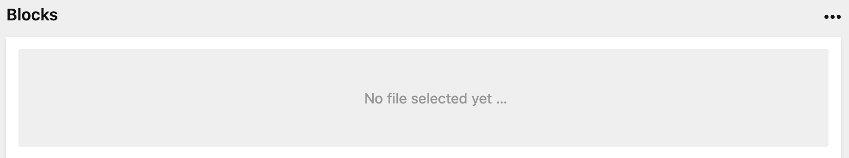
We also add some missing pieces, i.e. the subtitle and the description.
Note how we use the v-html directive to render the contents of the descriptions field, which is a writer field that contains HTML. If we would try to render it without this directive, all HTML tags would be shown as plain text.
v-html should only be used if you trust the HTML that's being entered. Our writer field already sanitizes the HTML so we are fine here.
Adding the poster and some styling
For the poster that is stored in the poster field, we take advantage of Kirby's k-aspect-ratio Vue component to display a square image.
<k-aspect-ratio class="k-block-type-audio-poster" ratio="1/1" cover="true">
  <img
    v-if="poster.url"
    :src="poster.url"
    alt=""
  >
</k-aspect-ratio>
We use a hard-coded ratio and set the cover attribute to true, but this can of course be made configurable from the blueprint.
We haven't defined the posterUrl method yet, which does the same as the source method for the audio.
Here is the complete code for this step with some added styling:
<template>
<k-block-figure
:is-empty="!source.url"
empty-icon="audio-file"
empty-text="No file selected yet …"
@open="open"
@update="update"
>
<div class="k-block-type-audio-wrapper">
<div>
<k-aspect-ratio
class="k-block-type-audio-poster"
cover="true"
ratio="1/1"
>
<img
v-if="poster.url"
:src="poster.url"
alt=""
>
</k-aspect-ratio>
</div>
<div>
<h1 class="k-block-type-audio-title">
{{ content.title }}
</h1>
<h2 class="k-block-type-audio-subtitle">
{{ content.subtitle }}
</h2>
<div class="k-block-type-audio-description" v-html="content.description"></div>
<audio class="k-block-type-audio-element" controls>
<source :src="source.url" type="audio/mpeg">
</audio>
</div>
</div>
</k-block-figure>
</template>
<script>
export default {
computed: {
poster() {
return this.content.poster[0] || {};
},
source() {
return this.content.source[0] || {};
}
}
};
</script>
<style lang="scss">
.k-block-type-audio-wrapper {
display: flex;
padding: 1rem;
background: black;
color: white;
}
.k-block-type-audio-poster {
width: 12rem;
margin-right: 1rem;
background: #333;
}
.k-block-type-audio-title,
.k-block-type-audio-subtitle {
font-size: 1.5rem;
}
.k-block-type-audio-title {
font-weight: 600;
}
.k-block-type-audio-subtitle {
margin-bottom: 1rem;
color: #999;
}
.k-block-type-audio-description {
line-height: 1.5;
}
.k-block-type-audio-element {
margin-top: 2rem;
height: 2rem;
}
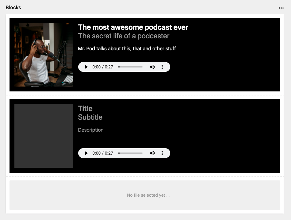
</style>It starts to look like what we anticipated at the beginning:

Side quest: Getting the mime type through the API
If you look closely, you will notice that we hard-coded the mime-type of the audio file all this time, because we don't have access to the mime type of the file through content.source[0]. In our example it doesn't really matter much because we limited the uploadable file types to .mp3 files. But once we want to allow multiple files types or want to provide multiple file formats for the same audio file, we better find out how to get at the file object (who knows, maybe you need exactly that piece of information in one of your next custom blocks).
Long story short, Kirby's API to the rescue. In this case, we need access to the endpoint api/pages/:id/files/:filename.
To this purpose, let's fetch more information about the file in a watch method.
//...
data() {
  return {
    mime: null
  };
},
watch: {
  "source.link": {
    handler(link) {
      if (link) {
        this.$api.get(link).then(file => {
          this.mime = file.mime;
        });
      }
    },
    immediate: true
  }
},
// ...
Watch methods are a fantastic concept in Vue.js to react on changes in your component. In this case, we watch for any changes to the link key of our source object. Isn't it fantastic that we can even watch nested keys with the dot syntax?
Whenever the source file changes, the handler method will run and fetch information about the file from the API with this.$api.get(link). With immediate: true we can tell the watch method to be called for the first time when the component has been created.
Once we get back the file from the API, we put the mime type into our new mime property, which we've defined in the component's data method. This will make it available in our template.
New status of our code:
<template>
  <k-block-figure
    :is-empty="!source.url"
    empty-icon="audio-file"
    empty-text="No file selected yet …"
    @open="open"
    @update="update"
  >
    <div class="k-block-type-audio-wrapper">
      <div>
        <k-aspect-ratio
          class="k-block-type-audio-poster"
          cover="true"
          ratio="1/1"
        >
          <img
            v-if="poster.url"
            :src="poster.url"
            alt=""
          >
        </k-aspect-ratio>
      </div>
      <div>
        <h1 class="k-block-type-audio-title">
          {{ content.title }}
        </h1>
        <h2 class="k-block-type-audio-subtitle">
          {{ content.subtitle }}
        </h2>
        <div class="k-block-type-audio-description" v-html="content.description"></div>
        <audio class="k-block-type-audio-element" controls>
          <source :src="source.url" :type="mime">
        </audio>
      </div>
    </div>
  </k-block-figure>
</template>

<script>
export default {
  data() {
    return {
      mime: null
    };
  },
  computed: {
    poster() {
      return this.content.poster[0] || {};
    },
    source() {
      return this.content.source[0] || {};
    }
  },
  watch: {
    "source.link": {
      handler(link) {
        if (link) {
          this.$api.get(link).then(file => {
            this.mime = file.mime;
          });
        }
      },
      immediate: true
    }
  },
};
</script>

<!-- styles here (see above ) -->
Congratulations. Side quest completed! 👏
Making the text fields editable
Ok, that was a lot of stuff. But we are not ready yet. As promised in the intro, we want to make the headlines and the description editable.
To do this, we will replace all text instances with k-writer components:
So instead of the h1 element
<h1 class="k-block-type-audio-title">{{content.title}}</h1>We use
<k-writer
  :inline="true"
  :marks="false"
  :placeholder="field('title').placeholder"
  :value="content.title"
  class="k-block-type-audio-title"
  @input="update({ title: $event })"
/>
The writer component is a simple WYSIWYG editor for inline styles (bold, italic, etc.) With an enabled inline option, we will tell the editor to insert <br> instead of paragraphs for line breaks. With the marks option, we can activate or deactivate particular inline styles. We don't need them here. We could also use a simple input field instead, but the writer will adapt its size to the content and will also work better for the description field.
Another speciality of a block preview component is the built-in field method. We can use it to access blueprint settings for fields in our drawer. This is super handy to get field properties for our WYSIWYG preview. In this case, we get the placeholders from the blueprint: field('title').placeholder
If we repeat this procedure for every field, we end up with our final result:
<template>
  <k-block-figure
    :is-empty="!source.url"
    empty-icon="audio-file"
    empty-text="No file selected yet …"
    @open="open"
    @update="update"
  >
    <div class="k-block-type-audio-wrapper">
      <div>
        <k-aspect-ratio
          class="k-block-type-audio-poster"
          cover="true"
          ratio="1/1"
        >
          <img
            v-if="poster.url"
            :src="poster.url"
            alt=""
          >
        </k-aspect-ratio>
      </div>
      <div @dblclick.stop>
        <k-writer
          :inline="true"
          :marks="false"
          :placeholder="field('title').placeholder"
          :value="content.title"
          class="k-block-type-audio-title"
          @input="update({ title: $event })"
        />
        <k-writer
          :inline="true"
          :marks="false"
          :placeholder="field('subtitle').placeholder"
          :value="content.subtitle"
          class="k-block-type-audio-subtitle"
          @input="update({ subtitle: $event })"
        />
        <k-writer
          :inline="true"
          :marks="false"
          :placeholder="field('description').placeholder"
          :value="content.description"
          class="k-block-type-audio-description"
          @input="update({ description: $event })"
        />
        <audio class="k-block-type-audio-element" controls>
          <source :src="source.url" :type="mime">
        </audio>
      </div>
    </div>
  </k-block-figure>
</template>

<script>
export default {
  data() {
    return {
      mime: null
    };
  },
  computed: {
    poster() {
      return this.content.poster[0] || {};
    },
    source() {
      return this.content.source[0] || {};
    }
  },
  watch: {
    "source.link": {
      handler (link) {
        if (link) {
          this.$api.get(link).then(file => {
            this.mime = file.mime;
          });
        }
      },
      immediate: true
    }
  }
};
</script>

<style lang="scss">
.k-block-type-audio-wrapper {
  display: flex;
  padding: 1rem;
  background: black;
  color: white;
}
.k-block-type-audio-poster {
  width: 12rem;
  margin-right: 1rem;
  background: #333;
}
.k-block-type-audio-title,
.k-block-type-audio-subtitle {
  font-size: 1.5rem;
}
.k-block-type-audio-title {
  font-weight: 600;
}
.k-block-type-audio-subtitle {
  margin-bottom: 1rem;
  color: #999;
}
.k-block-type-audio-description {
  line-height: 1.5;
}
.k-block-type-audio-element {
  margin-top: 2rem;
  height: 2rem;
}
</style>
Note that we ignored the audio settings like controls and autoplay for the preview because they are not relevant here. If you want to change that, you should know enough by now to adapt all settings to your liking.
You also might have noticed this line:
<div @dblclick.stop>The <k-block-figure> component has a built-in handler to open the block drawer on double-click. This is cool, but it's not ideal for writer components. I.e. you might want to double-click to select some text. With @dblclick.stop we can prevent the double-click event from bubbling up. The drawer will not open when we double-click on one of the writers.
You should definitely check out the docs for Vue’s awesome event handling shortcuts for more tricks like this.
End result
As a last step, we run the final build step with
npm run buildThis will create the final index.js and index.css files that are now ready to be shipped. Your plugin is finished!
In its different states the block now looks like this: