Responsive images
Intro
On many websites, images account for the majority of the overall weight of the page. If these images are not optimized in size, dimension, resolution, or format for the devices and viewports on which they are displayed, overall performance and user experience suffer.
Responsive image strategies aim to deliver the right image to browsers on different devices and viewports, so they look equally good on a large desktop or a tiny smartwatch. But more importantly, our pages load faster, make users happier, lead to better performance metrics, and ultimately even help our climate because fewer resources are wasted.
When we combine responsive images with modern image formats and lazy-loading for off-screen images, the payload of our (initial) page will decrease tremendously.
Kirby does not come with responsive images implemented out-of-the-box. We have to implement them ourselves. However, Kirby provides us with the tools we need to implement them. You will soon see why a one-size-fits-all solution makes no sense at all.
From resolution switching to art direction
Images can be made responsive using two basic approaches:
- Resolution switching: Providing the same image to all devices, just in different sizes/resolutions.
- Art Direction: Providing different image details or even a completely different image depending on the device, screen size or resolution, e.g. a landscape format on desktop and a cropped square version on mobile.
Art direction is more complex and we will only touch on it briefly. However, this recipe will enable you to implement such an approach when needed.
To further boost performance, we'll also learn how to use modern image formats (such as WebP or AVIF) wherever possible, as these often offer smaller file sizes without sacrificing quality.
Factors that determine the ideal image size
Four factors determine the "perfect" image size:
- Viewport: The current size of the browser window
- Device Pixel Ratio (DPR): The ratio between physical pixels and logical pixels (note that media queries respond to a device's logical pixels)
- Image dimensions: the physical dimensions of the image
- Size at which the image will be rendered: In a page layout, an image might span the full viewport or just a portion of it
While the browser knows the viewport and DPR of the current device, the other two factors are known only to us, the developers or designers. We therefore need to provide this information so that the browser can select the correct image.
Expressed in PHP variables, the formula for the perfect image size would look something like this:
$idealImageSize = $viewportWidth / $sizeAtWhichImageWillBeRendered * $dprFor a device with a logical viewport width of 390 pixels and a DPR of 3, an image covering the entire width of the viewport would have an ideal size of 1170 pixels.
How to make images responsive
Let's start with looking at a standard img element: It has a src attribute that points to a single image version.
<?php if ($image = $page->image('flower-power.jpg')): ?>
    <img src="<?= $image->url() ?>" alt="<?= $image->alt() ?>">
<?php endif ?>
This element provides the same image size for all viewport sizes. With the right CSS settings, it adapts to the actual viewport, even if it's huge, but transfers much more data than necessary. If we look under the hood of the websites we visit, we will still find many websites that output images this way. But with a little extra work, we can do better.
srcset
We enter the realm of responsive images if we add a srcset attribute to the image element. This allows us to provide alternate versions of an image in different sizes or pixel densities so that the browser can choose the best fit.
The srcset attribute takes a list of image options separated by a comma. In plain HTML, it looks like this:
<img
    alt="A colorful flower of unknown type"
    src="flower-power-400.jpg"
    srcset="flower-power-400.jpg 400w,
            flower-power-800.jpg 800w,
            flower-power-1200.jpg 1200w"
>
In this example, we specify the smallest image for the src attribute, and three different sizes via the srcset attribute. Browsers which support srcset calculate which image is best for the current use, while other browsers fall back to the image provided by the src attribute.
Let's look at how we can implement this with Kirby. The $file->srcset() method makes our life easy:
<?php if ($image = $page->image('flower-power.jpg')): ?>
    <img
        alt="<?= $image->alt() ?>"
        src="<?= $image->resize(400)->url() ?>"
        srcset="<?= $image->srcset([300, 600, 900, 1200, 1800]) ?>"
        width="<?= $image->resize(1800)->width() ?>"
        height="<?= $image->resize(1800)->height() ?>"
    >
<?php endif ?>
We pass an array of desired sizes to the srcset() method, and Kirby does the rest for us. This code will render the same output as our plain HTML example above and is the same as using an explicit associative array like this:
<?php if ($image = $page->image('flower-power.jpg')): ?>
    <img
        alt="<?= $image->alt() ?>"
        src="<?= $image->resize(900)->url() ?>"
        srcset="<?= $image->srcset(
            [
                '300w'  => ['width' => 300],
                '600w'  => ['width' => 600],
                '900w'  => ['width' => 900],
                '1200w' => ['width' => 1200],
                '1800w' => ['width' => 1800],
            ]
        )?>"
        width="<?= $image->resize(1800)->width() ?>"
        height="<?= $image->resize(1800)->height() ?>"
    >
<?php endif ?>
If you are wondering now why you should use this longer syntax when both return the same result: Well, we need it if we want to change the quality or format of the thumbs or crop the images:
<?php if ($image = $page->image('flower-power.jpg')): ?>
    <img
        alt="<?= $image->alt() ?>"
        src="<?= $image->thumb(['width' => 300, 'height' => 300, 'quality' => 80, 'crop' => center, 'quality' => 80])->url() ?>"
        srcset="<?= $image->srcset(
            [
                '300w'  => ['width' => 300, 'height' => 300, 'crop' => 'center', 'quality' => 80],
                '600w'  => ['width' => 600, 'height' => 600, 'crop' => 'center', 'quality' => 80],
                '900w'  => ['width' => 900, 'height' => 900, 'crop' => 'center', 'quality' => 80],
                '1200w' => ['width' => 1200, 'height' => 1200, 'crop' => 'center', 'quality' => 80],
                '1800w' => ['width' => 1800, 'height' => 1800, 'crop' => 'center', 'quality' => 80],
            ]
        )?>"
        width="<?= $image->thumb(['width' => 1800, 'height' => 1800, 'quality' => 80, 'crop' => true])->width() ?>"
        height="<?= $image->thumb(['width' => 1800, 'height' => 1800, 'quality' => 80, 'crop' => true])->height() ?>"
    >
<?php endif ?>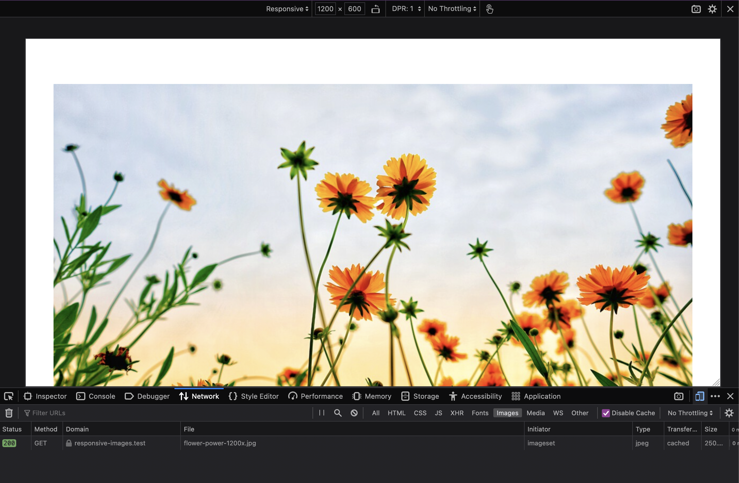
But let's not get distracted, let's move on to some explanations....
The width descriptor: w
With the w value after the image name, we tell the browser the physical width of the image, so it can calculate which image to use. So the w value must always indicate the actual image width, as in the examples above.
The density descriptor: x
Another possibility is to specify an x value instead of the w value. It represents the device pixel ratio (DPR) at which an image should be rendered, and is only used for images that should always berendered at a fixed size, e.g. 150 pixels, regardless of the viewport (for example, a logo, icon, or user avatar).
However, since devices have different DPRs, we provide different image sizes for a given DPR to ensure that the image always looks good.
Here is an example of an HTML representation:
<img
    alt="Emilia's avatar"
    src="emilia_150px.jpg"
    srcset="emilia_150px.jpg 1x,
            emilia_300px.jpg 2x,
            emilia_450px.jpg 3x"
>
In Kirby syntax, we can do it like this:
<?php if ($image = $page->image('emilia.jpg')): ?>
    <img
        alt="<?= $image->alt() ?>"
        src="<?= $image->resize(150)->url() ?>"
        srcset="<?= $image->srcset(
            [
                '1x'  => ['width' => 150],
                '2x'  => ['width' => 300],
                '3x'  => ['width' => 450],
            ]
        )?>"
        width="<?= $image->resize(150)->width() ?>"
        height="<?= $image->resize(150)->height() ?>"
    >
<?php endif ?>
On an old device with a Device Pixel Ratio (DPR) of 1, the browser will now use the 1x image, but on the latest iPhone with a DPR of 3, it will use the 3x image, while always displaying the image at a size of 150px.
But back to our images with a width descriptor (w). Our example from above works fine when we have full width images, but we run into a problem when our images are placed in a grid on a large screen where they only take up 50% or even less of the available space. In such cases, if we only use the srcset attribute, the browser will still download images that are far too large, because the browser does not know how much space the image takes up before it downloads it, and therefore makes its calculation based on the entire viewport.
Enter: The sizes attribute.
sizes
The sizes attribute tells the browser at what size an image should be rendered under certain conditions.
Each rule consists of a media condition followed by the length of the slot that the image will fill when the condition is met. These conditions are a subset of the CSS media queries.
The length value can be an absolute pixel value, a relative value (vw), or value calculated with calc().
Our HTML for such a scenario could look like this:
<img
    alt="A colorful flower of unknown type"
    src="flower-power-300.jpg"
    srcset="flower-power-300.jpg 300w,
            flower-power-600.jpg 600w,
            flower-power-900.jpg 900w,
            flower-power-1200.jpg 1200w,
            flower-flower-1800.jpg 1800w"
    sizes="(min-width: 1200px) 25vw,
            (min-width: 900px) 33vw,
            (min-width: 600px) 50vw,
            100vw"
>
As Kirby implementation, we end up with this code:
<?php if ($image = $page->image('flower-power.jpg')): ?>
    <img
        alt="<?= $image->alt() ?>"
        src="<?= $image->resize(300)->url() ?>"
        srcset="<?= $image->srcset([300, 600, 900, 1200, 1800]) ?>"
        sizes="(min-width: 1200px) 25vw,
                (min-width: 900px) 33vw,
                (min-width: 600px) 50vw,
                100vw"
        width="<?= $image->resize(1800)->width() ?>"
        height="<?= $image->resize(1800)->height() ?>"
    >
<?php endif ?>
At a screen size of 1200px and above, our image will take up a 25% of the viewport width, between 900px and 1200px 33% of the viewport width, between 600px and 900px 50% of the viewport width, and below 600px the full viewport width.
With large margin or padding settings, it might make sense to use calc() to provide more exact hints.
Note that the order of these rules is important, as the browser will apply the first matching rule and ignore any that follow. So if you were to use max-width instead of min-width, you would need to start with the smallest size condition.
With this information, the browser is now ready to do its calculations: With a viewport of 1200px and a DPR of 2, the browser now chooses the 600px image (300px rendered image size multiplied by 2), while without the sizes attribute it would use the largest image we provide in this example, 1800px.
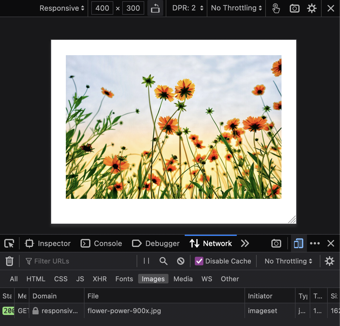
Testing screen sizes in the browser
When you load a website for the first time, your browser usually caches all the images so that it doesn't have to download them all again when you reload. Also, the browser will not load a smaller version of an image if a larger version of that image has already been cached.
So if you want to test which image version your browser uses at a given screen size, it's important to test with the cache disabled or cleared.
- Open your developer tools
- Select the Network tab
- Check "Disable caching"
- Set the size of the browser window to the size you want to test (or use the device toolbar)
- Clear the network tab
- Reload the page
Config settings
With all the different image sizes, our code examples above look pretty repetitive. Wouldn't it be great if we could define these settings once and then use them over and over again in our templates? Of course, this question is purely rhetorical. So let's see how that works!
In our config.php file, we can define the thumbs.srcsets property like this:
return [
    // …your other settings
    'thumbs' => [
        'srcsets' => [
            'default' => [
                '300w'  => ['width' => 300],
                '600w'  => ['width' => 600],
                '900w'  => ['width' => 900],
                '1200w' => ['width' => 1200],
                '1800w' => ['width' => 1800]
            ],
            'square' => [
                '300w'  => ['width' => 300, 'height' => 300, 'crop' => 'center'],
                '600w'  => ['width' => 600, 'height' => 600, 'crop' => 'center'],
                '900w'  => ['width' => 900, 'height' => 900, 'crop' => 'center'],
                '1200w' => ['width' => 1200, 'height' => 1200, 'crop' => 'center'],
                '1800w' => ['width' => 1800, 'height' => 1800, 'crop' => 'center']
            ],
            // more srcsets as needed
        ]
    ]
];
The default srcset will be used if no other name or parameter is specified, so that we can shorten our last example from above to:
<?php if ($image = $page->image('flower-power.jpg')): ?>
    <img
        alt="<?= $image->alt() ?>"
        src="<?= $image->resize(600)->url() ?>"
        srcset="<?= $image->srcset() ?>"
        sizes="(min-width: 1200px) 25vw,
                (min-width: 900px) 33vw,
                (min-width: 600px) 50vw,
                100vw"
        width="<?= $image->resize(1800)->width() ?>"
        height="<?= $image->resize(1800)->height() ?>"
    >
<?php endif ?>
You can define as many srcsets as you need in your config.php.
You might be wondering: If we can tell the browser which image to use at what rendered size, why can't I use this to provide even different images at each viewport?
The truth is: When we are using srcset in the img element, we are just giving hints to the browser. It's totally up to the browser to decide which image to use, we have no control over it.
Modern image formats
With the support of WebP and AVIF in modern browsers, we get a big performance boost. WebP can produce high quality images with about 50% smaller files compared to JPEG, and AVIF can do even more.
To provide the browser with different image formats to choose from, we use the picture element. With the source element we provide alternative image versions, while the img element is needed to actually display the selected image.
As with the img element, we can use multiple images in the srcset attribute and use the sizes attribute to tell the browser which version to render and when.
Let's look at the HTML version first to see what this actually looks:
<picture>
    <source
        srcset="flower-power-300.avif 300px,
                flower-power-600.avif 600px,
                flower-power-900.avif 900px"
        sizes="(min-width: 640px) 300nw, 100vw"
        type="image/avif"
    >
    <source
        srcset="flower-power-300.webp 300px,
                flower-power-600.webp 600px,
                flower-power900.webp 900px"
        sizes="(min-width: 640px) 300px, 100%"
        type="image/webp"
    >
    <img
        alt="A colorful flower of unknown type"
        src="flower-power-300.jpg"
        srcset="flower-power-300.jpg 300px,
                flower-power-600.jpg 600px,
                flower-power-900.jpg 900px"
        sizes="(min-width: 640px) 300px, 100%"
    >
</picture>
Before we implement it in Kirby, let's make two more config settings for the avif and webp formats:
return [
    // …your other settings
    'thumbs' => [
        'srcsets' => [
            'default' => [
                '300w'  => ['width' => 300],
                '600w'  => ['width' => 600],
                '900w'  => ['width' => 900],
                '1200w' => ['width' => 1200],
                '1800w' => ['width' => 1800]
            ],
            'avif' => [
                '300w'  => ['width' => 300, 'format' => 'avif'],
                '600w'  => ['width' => 600, 'format' => 'avif'],
                '900w'  => ['width' => 900, 'format' => 'avif'],
                '1200w' => ['width' => 1200, 'format' => 'avif'],
                '1800w' => ['width' => 1800, 'format' => 'avif']
            ],
            'webp' => [
                '300w'  => ['width' => 300, 'format' => 'webp'],
                '600w'  => ['width' => 600, 'format' => 'webp'],
                '900w'  => ['width' => 900, 'format' => 'webp'],
                '1200w' => ['width' => 1200, 'format' => 'webp'],
                '1800w' => ['width' => 1800, 'format' => 'webp']
            ],
        ]
    ]
];
Now let's use these config settings in our Kirby implementation:
<?php
$sizes = "(min-width: 1200px) 25vw,
        (min-width: 900px) 33vw,
        (min-width: 600px) 50vw,
        100vw";

if ($image = $page->image('flower-power.jpg')): ?>
    <picture>
        <source
            srcset="<?= $image->srcset('avif') ?>"
            sizes="<?= $sizes ?>"
            type="image/avif"
        >
        <source
            srcset="<?= $image->srcset('webp') ?>"
            sizes="<?= $sizes ?>"
            type="image/webp"
        >
        <img
            alt="<?= $image->alt() ?>"
            src="<?= $image->resize(300)->url() ?>"
            srcset="<?= $image->srcset() ?>"
            sizes="<?= $sizes ?>"
            width="<?= $image->resize(1800)->width() ?>"
            height="<?= $image->resize(1800)->height() ?>"
        >
    </picture>
<?php endif ?>
Again, the order of the source elements is important because the browser will pick the first format it supports or the first rule that applies.
Extra: Use different images under certain conditions
While art direction is not our main concern here, let's have a quick look at how we can use the picture element for art direction.
Contrary to the img element, the picture element actually gives us control over what the browser does. So if a rule applies, the browser will use the image we supply for this rule.

An HTML version of such a setup could look like this:
<picture>
  <source media="(max-width: 600px)" srcset="sunflower.jpg">
  <source media="(min-width: 601px)" srcset="sunflower-field.jpg">
  <img src="sunflower-field.jpg" alt="A sunflower field">
</picture>
With Kirby's built-in thumb methods, we cannot create a close portrait of a person from a larger image automatically, therefore we would actually need these two image in our page folder.
<?php if ($image = $page->image('sunflower-field.jpg')): ?>
      <picture>
        <?php if ($sunflower = $page->image('sunflower.jpg')): ?>
          <source media="(max-width: 600px)" srcset="<?= $sunflower->srcset() ?>">
        <?php endif ?>
        <source media="(min-width: 601px)" srcset="<?= $image->srcset() ?>">
        <img
          alt="<?= $image->alt() ?>"
          src="<?= $image->resize(300)->url() ?>"
          srcset="<?= $image->srcset() ?>"
          width="<?= $image->resize(1800)->width() ?>"
          height="<?= $image->resize(1800)->height() ?>"
        >
      </picture>
    <?php endif ?>
What about KirbyTags and blocks?
So far, we have looked at how to deal with images that we control in our templates/snippets. But we can of course do the same for images used in the image and gallery blocks or the image KirbyTag. For the blocks, we would override the respective block snippets, and the image KirbyTag we can overwrite in a plugin.
A note on appropriate srcset sizes
To provide the "ideal" image size for every possible viewport and rendering size, we would have to create images in increments of 1px, which of course is not feasible at all. Therefore we have to try to find a good middle ground. The base is always the min and max values we want to support, and those are usually relatively easy to find based on analytics data. The more difficult part is to determine the values in between. Common approaches are:
- Using a fixed interval (like in the examples above) or doubling the smalles value until we arrive at the highest
- Using a fixed number of steps
- Using common device widths values
Another approach is to generate breakpoints at specific size steps, which you can do, for example, with Cloudinary's Responsive Image Breakpoints Generator. However, since the results of this approach are image-specific, using such an interactive tool only makes sense if you have few images (or too much time). To automate the process, you would need to use the paid API.
For most use cases where shaving off the last byte is not vital, a limited set of common sizes is usually a good compromise.
TL;DR
So what are the main take-aways from the above?
- Use the
srcsetattribute to provide the browser with an appropriate number of image width alternatives to choose from. - Use the
sizesattribute in addition to thesrcsetattribute if you use thesrcsetattribute with the width descriptor and your image is not used in full width. - Use the
pictureelement to make modern image formats such as Webp and AVIF available to supporting browsers, or for art direction. - Do not upload image sizes you are never going to use in the first place or replace them with smaller versions on upload to prevent unnecessary processing of huge images.