My first Panel section
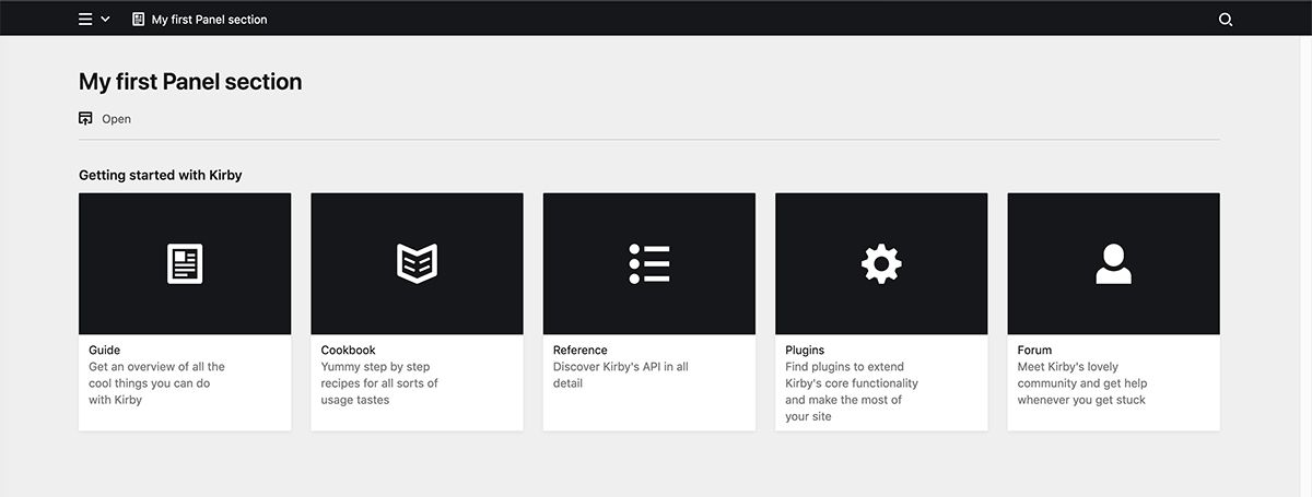
In this recipe, we will create a custom Panel section that displays a list of links with an icon, a title and a description. This is what it will look like once we are ready:
For the purposes of this recipe, we assume you have read the Panel plugin setup guide on how to get started with our Panel plugin bundler kirbyup.
You can install the Pluginkit as a basis or create the file structure we need manually, that's up to you. Also, it doesn't matter if you use the Plainkit or the Starterkit as a starting point.
Getting started
Please read the chapter about custom sections in the reference before starting with this example.
Let's get started with the plugin folder, we'll call it /linksection. Inside this folder, we create a package.json file which is needed so that kirbyup knows what to do.
{
  "scripts": {
    "dev": "npx -y kirbyup src/index.js --watch",
    "build": "npx -y kirbyup src/index.js"
  }
}
This will take care of compiling our source files into an index.js file in the root of our linksection plugin folder.
Register the section: PHP part
We also need an index.php file that contains the Kirby plugin wrapper, in which we define the section. The section definition itself goes into a separate file, which we will put into a separate /sections folder and require from there.
<?php

Kirby::plugin('getkirby/linksection', [
    'sections' => [
        'links' => require __DIR__ . '/sections/links.php',
    ],
]);
Note that while we could put the props array we now outsource to links.php into our index.php, the purpose here is to get an idea how we can structure our files in more complex plugins.
Inside links.php, we set the section's properties. We keep it simple and only set a label, a layout and a links property. These are the properties we can later define in the blueprint for the section.
<?php

return [
    'props' => [
        'label' => function ($label = 'Links') {
            return $label;
        },
        'layout' => function ($layout = 'list') {
            return $layout;
        },
        'links' => function($links = []) {
          return $links;
        }
    ]
];
Register the section: Vue part
Our new section also needs an index.js in which we register the section for the Vue part of the plugin.
import Links from "./components/sections/Links.vue";

panel.plugin("getkirby/linksection", {
  sections: {
    links: Links
  }
});
Inside this file, we import the Links.vue component and assign this component to the links section. The Links.vue is stored inside a sections subfolder. This is not a required folder structure, but it makes sense to start using such subfolders for your components, when you work with different types of components (ie. fields, sections, views, etc.)
Set up section component
Finally, we need the Links.vue component that contains the template and data for the section.
<template>

</template>

<script>
export default {
  data() {
    return {

    }
  }
};
</script>
At this point, we are ready to run…
npm run dev…in the linksection folder to compile our code into the main index.js.
Set up section in blueprint
If this went smoothly, we are ready to use the section in a blueprint, e.g. site.yml:
Title: Site
  sections:
    links:
      type: links
      label: Getting started
If we now open the Panel start page, we will not see anything yet in the browser. However, on inspecting the source code, there will be an empty div tag with a class of k-section k-section-name-links. Hurray!
Adding the missing pieces
Back to Links.vue. We now define the same properties that we already defined in links.php inside the data function of the component object. Unlike fields plugins, we cannot use regular Vue's props here. All sections are lazy-loaded individually and we have to fill our component data manually, once the props that we've defined in PHP have been loaded from the API.
<script>
export default {
  data() {
    return {
      label: null,
      layout: null,
      links: []
    }
  }
};
</script>
As a next step, we finalize our template, so it can later display the data:
<template>
  <section class="k-links-section">
    <header class="k-section-header">
      <h2 class="k-headline">{{ label }}</h2>
    </header>
    <k-collection
      :items="links"
      :layout="layout"
    />
  </section>
</template>
Kirby makes this really easy for us by providing default components we can reuse all over the place. Here we use the k-collection component. The k-collection components makes it easy to switch between the cards and list layouts. All we have to do is bind our data to the :items property and our layout to the :layout property.
Still, nothing to see in the Panel.
Manually adding some data
We can now quickly add some placeholder data so that we finally get something to see in the Panel:
<script>
export default {
  data() {
    return {
      label: "Links",
      layout: "list",
      links: [
        {
          icon: {
            type: "document",
            back: "black"
          },
          text: "Guide",
          link: "https://getkirby.com/docs/guide",
          info: "Get an overview of all the cool things you can do with Kirby",
          target: "_blank",
        }
      ]
    }
  }
};
</script>
Inside the data array, we use the keywords the k-collection component expects, and add a value to each. Et voilà, there is our first section entry in the Panel.
Fetching the data from the backend
The bit that is left to do, is to load the data from the API and let it replace the placeholder values. We do that within the created hook that is triggered when the component is ready, using the load() method. The load method is automatically injected into every section component and handles fetching the PHP properties from our links.php file.
When we get a response, we assign the values to our properties.
<script>
export default {
  data() {
    return {
      label: "Links",
      layout: "list",
      links: [
        {
          icon: {
            type: "document",
            back: "black"
          },
          text: "Guide",
          link: "https://getkirby.com/docs/guide",
          info: "Get an overview of all the cool things you can do with Kirby",
          target: "_blank",
        }
      ]
    }
  },
  created() {
    this.load().then(response => {
      this.label  = response.label;
      this.layout = response.layout;
      this.links  = response.links;
    });
  }
};
</script>
Once our props are correctly loaded from the backend, we can remove our hard-coded placeholder values:
<script>
export default {
  data() {
    return {
      label: "",
      layout: "list",
      links: []
    }
  },
  created() {
    this.load().then(response => {
      this.label  = response.label;
      this.layout = response.layout;
      this.links  = response.links;
    });
  }
};
</script>
We now have a working connection between our section backend and our section frontend and we can freely pass data from blueprints and computed PHP props to our Vue component.
The blueprint with the final section definition
Finally, let's add the data we want to show in the section to the section definition:
sections:
  links:
    type: links
    label: Getting started
    layout: cards
    links:
      -
        icon:
            type: document
            back: black
        link: 'https://getkirby.com/docs/guide'
        target: _blank
        text: Guide
        info: Get an overview of all the cool things you can do with Kirby

      -
        icon:
            type: book
            back: black
        link: 'https://getkirby.com/docs/cookbook'
        target: _blank
        text: Cookbook
        info: Yummy step by step recipes for all sorts of usage tastes

      -
        icon:
            type: list-bullet
            back: black
        link: 'https://getkirby.com/docs/reference'
        target: _blank
        text: Referenz
        info: Discover Kirby's API in all detail

      -
        icon:
            type: cog
            back: black
        link: 'https://getkirby.com/plugins'
        target: _blank
        text: Plugins
        info: Find plugins to extend Kirby's core functionality and make the most of your site

      -
        icon:
            type: user
            back: black
        link: 'https://forum.getkirby.com'
        target: _blank
        text: Forum
        info: Meet Kirby's lovely community and get help whenever you get stuck
Change the layout to list in the blueprint to see how your section is now displayed as a list.
Building the plugin
Once you are happy with your plugin, you can create minified and optimized versions of the index.js and index.css (if you have added custom styles) with…
npm run buildFinal folder structure
linksection
- index.js
- package.json
sections
- links.php
src
- index.js
components
sections
- Links.vue
Where to go from here
This is a very basic example that should still have given you an understanding of how the different parts play together and enable you to set up your first custom sections for your clients. The data to fill this section can come in fact come from anywhere, you can provide it through a route, a database or whatever you see fit. And you probably don't just want to display stuff, but add actions to each item etc. We'll cover that in future recipes.
You don't have to use the components Kirby provides, either, but can come up with your own markup and design. The possibilities are pretty much endless.