My first Panel field
This cookbook recipe is based on these two video episodes…
…and a question that recently came up on the forum.
What we will cover
In this recipe, we start with the basics of creating a field from scratch using a Vue.js single file component, and then build on this by reusing parts of Kirby's UI Kit. We will deviate a little from the example in the videos though, and our final result will be a text input for DOI names, with a link that allows us to verify the input by calling the link https://www.doi.org/ suffixed with the field input.
For the purposes of this recipe, we assume you have read the Panel plugin setup guide on how to get started with our Panel plugin bundler kirbyup.
You can install the Pluginkit as a basis or create the file structure we need manually, that's up to you. Also, it doesn't matter if you use the Plainkit or the Starterkit as a starting point.
Let's start by creating a new folder in the plugins folder called doifield. Inside this folder, we create a package.json file with the contents copied from the Pluginkit example mentioned above.
{
  "scripts": {
    "dev": "npx -y kirbyup src/index.js --watch",
    "build": "npx -y kirbyup src/index.js"
  }
}
This will take care of compiling our source files into an index.js file in the root of our doifield plugin folder.
Register the field: PHP part
As for any plugin, we first create an index.php file containing the Kirby plugin wrapper, in which we define the field. Within the fields array, we register the new doi field type and assign an empty array as value. This array would contain the backend logic for our field if needed. We skip this part for now.
<?php

Kirby::plugin('pluginAuthor/doi', [
    'fields' => [
        'doi' => [
          // here we could define the backend logic for our field if needed
        ]
    ]
]);
Register the field: Vue part
Next, we create a new folder called /src in the doifield folder, and in the /src folder an index.js file.
In index.js we also have to register the new field like in index.php, but here using JavaScript syntax:
panel.plugin('pluginAuthor/doi', {
  fields: {
    doi: {
      // here goes the code for the field
    }
  }
});
To make the field work without errors, we also have to add a template property. Let's start with something really basic.
panel.plugin('pluginAuthor/doi', {
  fields: {
    doi: {
      template: "<p>Hello</p>"
    }
  }
});
Build and run
Ok, now that we got the most basic field definition in place, we are ready to run…
npm run dev…in the /doifield folder to compile the code. If everything works as expected, there will now be a compiled index.js file in the doifield folder.
Blueprint
Let's add this new field type in a blueprint and view the result in the Panel, for example in /site/blueprints/pages/sandbox.yml in the Starterkit (you can use any other blueprint).
Title: A Blueprint
fields:
doi:
type: doi
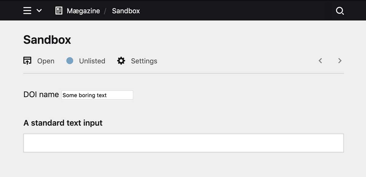
label: DOI nameWhen we open the unlisted Sandbox page in the Panel, we can see the doi field in the Panel:
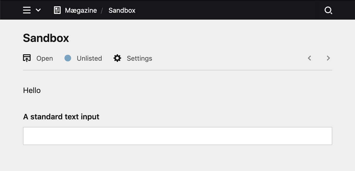
Ok, ok, this only prints Hello and is far from impressive, but hey, it's a start.
Using a single file component
Before we continue, let's clean up a bit and introduce a single file component, in which we will store the client-side logic of the field.
So let's create a \components folder in the /src folder, in that a /fields folder and inside that a DoiField.vue file, so that the folder structure looks like this:
doifield
src
components
fields
- DoiField.vue
- index.js
- index.js
- index.php
- package.json
In the single file component, we recreate the template inside template tags:
<template>
  <p>Hello world</p>
</template>

<script>
  // here goes the Vue code
</script>

<style>
  /* optional scoped styles for the component */
</style>
We are also adding the script tags that will shortly contain the logic for the field and an optional style tag (we will not use custom styles for this example, so you might as well omit them).
In /src/index.js, we import this new component, assign the component to the doi field and remove the template property from the first iteration, so that it looks like this:
import DoiField from "./components/fields/DoiField.vue";
panel.plugin('pluginAuthor/doi', {
  fields: {
    doi: DoiField
  }
});
In the Panel, we won't see any changes at this point.
Creating an HTML field input
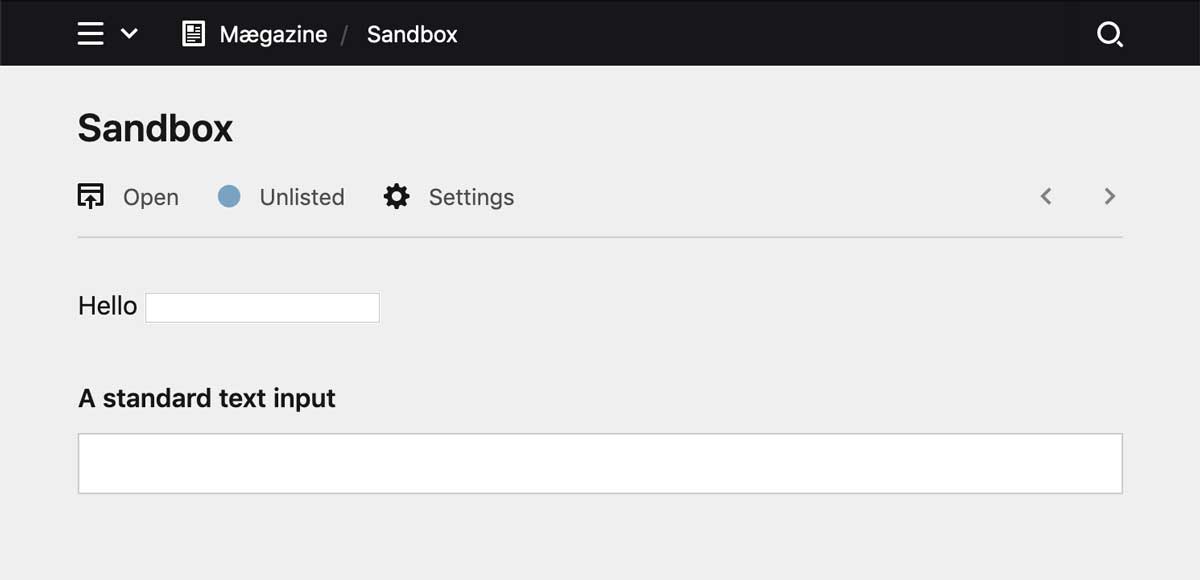
Let's move a little further and turn this into a real field input using a standard HTML input tag:
<template>
  <div>
    <label for="textfield">Hello</label>
    <input type="text" name="textfield">
  </div>
</template>
After the code compiles, we now have an input field with a an hard-wired Hello label. And while you can type text into the input field, you will not be able to store it. But one step after the other, so how do we get the Doi field label we already put into the blueprint into our field label?
Here come props
In Vue.js, we have to define props. Props are basically the data that once defined, you can then use in the component. In a Kirby context, they bridge the gap between the field options we define in our .yml blueprints and the frontend. The props take what is defined in the .yml files and send it to the field component via Kirby's API automatically. Let's add a label prop to the props array:
<script>
export default {
    props: {
        label: String
    }
}
</script>
A property consists of the key for the property and a value that contains at least the type we expect to have here, in this case we want a string.
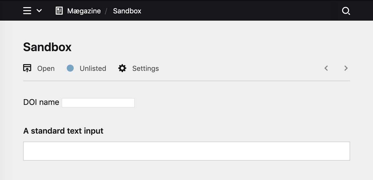
We can now replace the hard-wired Hello world string with the label defined in the blueprint using the most basic form of data binding. The Mustache tag will be replaced with the value of the label property.
<template>
<div>
<label for="textfield">{{ label }}</label>
<input type="text" name="textfield">
</div>
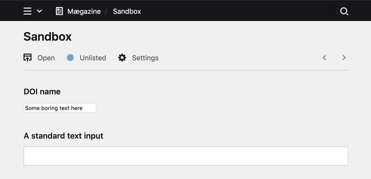
</template>If you now change the field label in the blueprint and reload the page, you can see how the value for the label changes as well.
Once we reload the page in the Panel, we see that the label has changed:
Load value of field into Panel
Currently, our input field has no content yet. Before we start editing the field in the Panel, let's add some content in our text file and see how we can load the value of the field into the input field.
Title: Sandbox

----

Doi: Some boring text
Let's add value as a prop and bind this value to the input field with :value="value".
<template>
  <div>
    <label for="textfield">{{ label }}</label>
    <input type="text" name="textfield" :value="value">
  </div>
</template>

<script>
export default {
  props: {
    label: String,
    value: String
  }
}
</script>
:value="value" is shorthand syntax for the Vue.js v-bind directive, which can be used instead of the long form `v-bind:value="value".
Great, we can now bind the value in the text field to the input. But if we try to change the value in the Panel, nothing will happen yet, no orange save bar will pop up, and we cannot store changes.
Events
At this point, the Panel doesn't know when something changes, so we have to tell it somehow.
In Vue.js, we can use the v-on directive to listen to DOM events and run some JavaScript when they’re triggered. In this case, we want to listen to the input event, and call the onInput() method when the event is triggered. We can do this in Vue.js with v-on:input="onInput", but since we are a bit lazy we use the shorthand `@input="onInput" instead, so that the template code now looks like this:
<template>
  <div>
    <label for="textfield">{{ label }}</label>
    <input type="text" name="textfield" :value="value" @input="onInput">
  </div>
</template>
To make the code work, we still have to add the onInput() method:
<script>
export default {
  props: {
    label: String,
    value: String
  },
  methods: {
    onInput(event) {
      this.$emit("input", event.target.value);
    }
  }
}
</script>
We have to define this method in the methods definition.
We can now use standard JavaScript to fetch the value from the input field with event.target.value. Using Vue's $emit directive, we emit the input event which the Panel expects here, and pass the field value to it.
And that's it. When we now return to the Panel, we can edit the field value and as soon as we do so, the orange bar at the bottom pops up, allowing us to either store the new or revert to the original value 🎉.
Reusing standard Kirby components
Our field is still looking ugly and quite unlike the other fields around it. How can we change their appearance without having to write many lines of custom CSS?
Well, Kirby comes with a large set of ready-to-use standard components that we can reuse in our plugins and that free us from the trouble of having to style everything manually.
These standard components all start with k- followed by the name of the component. You find the full set Kirby's UI components in the Reference.
We start with replacing the wrapper div with the k-field component. Each component has a set of props that we can leverage to reduce the HTML code, in this case, the k-field component has a label property to which we can bind the value of the label property. Once we've added that, we can remove the <label> tag.
<template>
  <k-field class="k-doi-field" :label="label">
    <input type="text" name="textfield" :value="value" @input="onInput">
  </k-field>
</template>
Hurray, our field immediately starts looking better with the label above the input.
The input field we replace with a k-input component and add the theme prop to make it look like an input field:
<template>
  <k-field class="k-doi-field" :label="label">
    <k-input theme="field" type="text" name="textfield" :value="value" @input="onInput">
  </k-field>
</template>
While this looks good now, we get an error as soon as we start typing something now. That's because the input component also takes care of sending the value to the input event, so that we don't have to get it from the event.target anymore. Instead, we pass the value as parameter to the onInput() method and replace event.target.value with just value.
<script>
export default {
  props: {
    label: String,
    value: String
  },
  methods: {
    onInput(value) {
      this.$emit("input", value);
    }
  }
}
</script>
With this, we now have a fully working input field that looks like a normal text field.
We can now add more props, if we want, to make the standard field properties like help, disabled, required work as well.
The input element also accepts some props, like before and after.
Whatever the user types into the blueprint, is automatically passed on to the frontend, if you define the property in the props array.
<template>
  <k-field
    class="k-doi-field"

    :disabled="disabled"
    :help="help"
    :label="label"
    :required="required"
    :when="when"
    >
    <k-input
      :after="after"
      :before="before"
      :icon="icon"
      theme="field"
      type="text"
      name="textfield"
      :value="value"
      @input="onInput">
  </k-field>
</template>

<script>
export default {
  props: {
    after: String,
    before: String,
    disabled: Boolean,
    help: String,
    icon: String,
    label: String,
    required: Boolean,
    when: String,
    value: String,
  },
  methods: {
    onInput(value) {
      this.$emit("input", value);
    }
  }
}
</script>
Try it out by adding these properties in the blueprint and watch the results in the Panel.
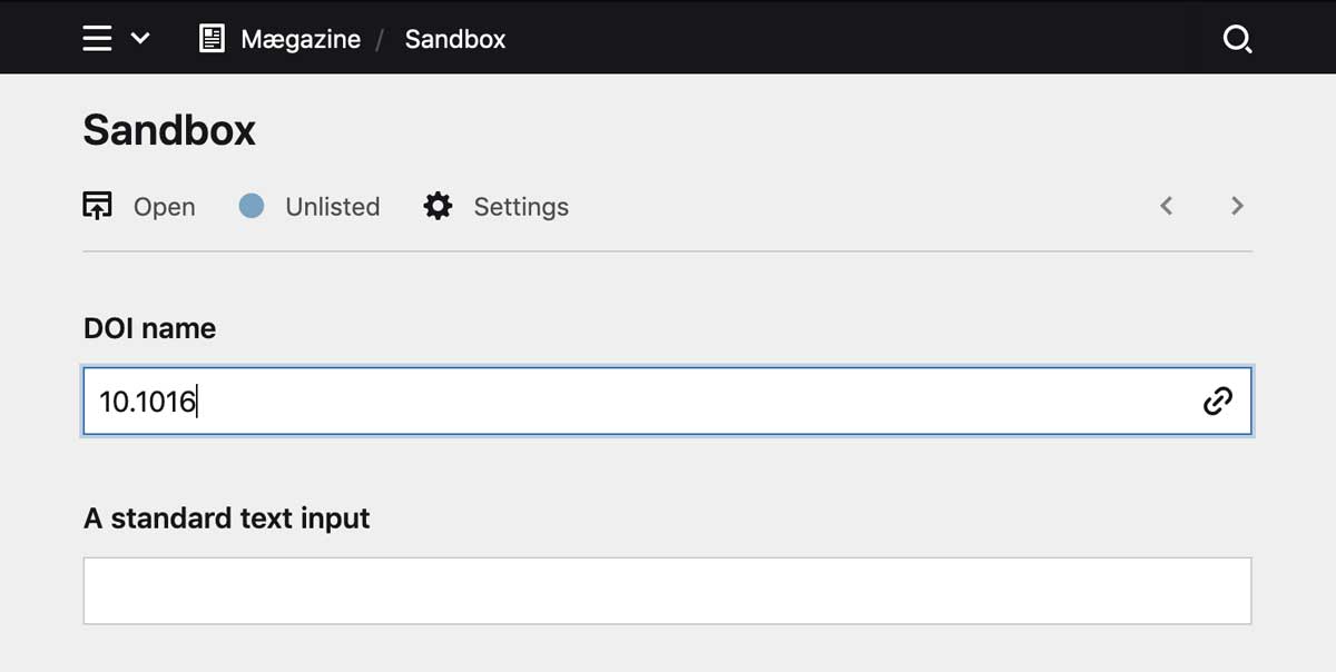
Extending the field
As you probably know, the url field has a clickable button that when clicked opens the link stored in the field in the browser. We are going to add such a link to our doi field now.
We can achieve this by stealing the template code from the url field, it's just a button that is inserted inside the k-input field and takes the slot reserved for the icon.
<template>
  <k-field
    class="k-doi-field"
    :disabled="disabled"
    :help="help"
    :label="label"
    :required="required"
  >
    <k-input
      :after="after"
      :before="before"
      theme="field"
      type="text"
      :value="value"
      @input="onInput"
    >
      <k-button
        v-if="link"
        :icon="icon"
         :link="'https://doi.org' + '/' + value"
        slot="icon"
        :tooltip="$t('open')"
        class="k-input-icon-button"
        tabindex="-1"
        target="_blank"
      />
    </k-input>
  </k-field>
</template>
What's new here? With the v-if directive, we define that the button is only shown if the link prop is set to true, which it is by default (we can disable this via the blueprint). In the link pro, we prepend a hard-wired URL to the field value. We could make this more dynamic by introducing a new property if we wanted, but we leave it as is.
We still have to define the new props link and icon. This time, they look a bit different, because we add on object with the type and a default value.
<script>
export default {
  props: {
    after: String,
    before: String,
    disabled: Boolean,
    help: String,
    label: String,
    required: Boolean,
    value: String,
    icon: {
      type: String,
      default: "url"
    },
    link: {
      type: Boolean,
      default: true
    }

  },
  methods: {
    onInput(value) {
      this.$emit("input", value);
    }
  }
}
</script>
Voilà, our new doi field is ready for use.